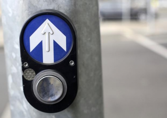
Sublime design: the PB/5 pedestrian button
The PB/5 pedestrian button is unlikely to be on many people’s top ten lists as a “design classic”, but it does possess a number of remarkable design attributes, writes Miles Park.
The PB/5 pedestrian button is unlikely to be on many people’s top ten lists as a “design classic”, but it does possess a number of remarkable design attributes, writes Miles Park.

OPINION: We are more likely to thump this instantly recognisable design, on a daily basis, than to give it much thought. The PB/5 pedestrian button, a type of “Audio-Tactile Pedestrian Detector” (ATPD), is a successful Australian design that has been populating towns and cities across Australia since 1984 and exported to countries including Ireland, the US, New Zealand and Singapore.
The button, commissioned by the then NSW Department of Main Roads, addressed pedestrians' safety at traffic light crossings and, most notably, the growing concerns for the safety of vision and hearing-impaired pedestrians.
Successfully commercialised manufactured products are always the result of many people’s efforts. The team behind the PB/5 pedestrian button was led by industrial designer David Wood from Nielsen Design Associates, acoustical engineer Louis Challis, and roads and traffic authority (RTA) engineer Frank Hulscher.
Audio design
The PB/5 pedestrian button embodies an audio-tactile device combining a two-rhythm buzzer, a vibrating touch panel, and braille direction arrow. Earlier attempts at an audio signalling pedestrian button in the 1960s incorporated a bell and buzzer audio signalling feature. In addition to the green “walk” signal, visually-impaired pedestrians were meant to cross when the sound of a ringing bell changed to a buzzer.
Unfortunately these earlier audio pedestrian buttons caused confusion due to their inconsistent installation from location to location and the sound transition was far from intuitive as a signal to “walk”. Furthermore, when the bell mechanism malfunctioned it could be mistaken as sounding like a buzzer and cause deadly confusion.
In 1976, in response to these concerns, acoustic consultants Louis A. Challis and Associates were tasked to redesign the audio signalling. They devised the now familiar two-rhythm buzzer and added a vibrating touch panel. The slower rhythm transitioning to a faster rhythm indicates a positive walk (cross) signal. A locating tone, that can adjust automatically to compensate for ambient road noise, assists users to find the push button and unmistakably indicate a “don’t walk” phase.
Industrial design
The design that we are familiar with today unifies the audio-tactile signalling features with a distinctive and robust form expressed as a diecast aluminium housing and polished stainless steel button. A braille and printed arrow on the vibrating plate indicates the direction for crossing.
The product form was derived from the shape of traffic lights. The epoxy power-coated aluminium castings and tamper proof fasteners ensure that the design is weather and vandal proof. Carl Nielsen (of Nielsen Design Associates) later referred to this need when designing products for public environments as “pre-vandalising” - leaving nothing to fail when installed.
The distinctive push button was designed to withstand millions of pushes. This was achieved by mechanically isolating the movement of the button from the electrical switching mechanism. The button floats on a sliding shaft. Magnets offer the button an initial resistance when pressed before sliding in on its shaft. A change in magnetism of this action triggers an electronic reed switch initiating the request to “walk”.
So it matters little if you lightly press it once or give it quick succession of light jabs. The designers were well aware of human behaviour, our impatience and tendency to overestimate the time we actually wait for the lights to change. So, irrespective of your specially developed button pressing technique, unfortunately the wait will be the same.
A design classic?
Given its success in improving pedestrian safety at crossings and its longevity as a widely used design, it certainly demonstrates the qualities of a good design. The PB/5 pedestrian button is unlikely to be on many people’s “top ten” lists as a “design classic”, but it does possess a number of classic design attributes, including: form, function, safety, sustainability, quality, commerciality and innovation.
I would like to add an extra attribute: inconspicuous. A product design should do its job quietly and efficiently without drawing undue attention to itself. So my inconspicuous design classic is the PB/5 pedestrian button … even if using it won’t change the lights fast enough.
Miles Park is a senior lecturer in Industrial Design at UNSW.
This opinion piece was first published in The Conversation, opens in a new window.